교재 내용을 따라 기본 Project 생성 및 설정 진행.
Count 프로젝트 생성, TypeScript 설치, styped-component 설치 그리고 babel-plugin 을 설치합니다.
babel-plugin 은 react-native의 상대 경로를, 절대 경로로 변경해주는 plugin 로
예로 import ../../../Button 이라면 import ~/Button 식의 경로를 사용 할 수 있습니다.
$ react-native init Count
$ cd Count
$ npm install --save styled-components
$ npm install --save-dev typescript @types/react @types/react-native
$ npm install --save-dev typescript @types/styled-components babel-plugin-root-import
이 후 typescript 설정을 위해 tsconfig.json 파일을 생성하고 다음과 같이 입력
{
    "compilerOptions": {
        "allowJs":true,
        "allowSyntheticDefaultImports":true,
        "esModuleInterop": true,
        "isolatedModules": true,
        "jsx":"react",
        "lib":["es6"],
        "moduleResolution": "node",
        "noEmit":true,
        "strict": true,
        "target": "esnext"
    },
    "exclude": ["node_modules", "babel.config.js", "metro.config.js","jest.config.js"]
}
절대경로로 컴포넌트를 추가하기 위해 아래와 같이 수정합니다.
module.exports = {
  presets: ['module:metro-react-native-babel-preset'],
  plugins: [
    [
      'babel-plugin-root-import',
      {
        rootPathPrefix: '~',
        rootPathSuffix: 'src',
      },
    ],
  ],
};
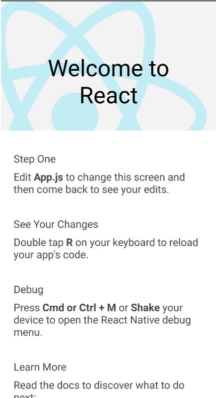
Main code 부 수정. App.js -> src/App.tsx 로 변경후 아래와 같이 작성.
교재 따라치다가 길어서, code 주워왔습니다.
import React, {Fragment} from 'react';
import {StatusBar, SafeAreaView} from 'react-native';
import {
  Header,
  LearnMoreLinks,
  Colors,
  DebugInstructions,
  ReloadInstructions,
} from 'react-native/Libraries/NewAppScreen';
import Styled from 'styled-components/native';
const ScrollView = Styled.ScrollView`
 background-color: ${Colors.lighter};
`;
const Body = Styled.View`
 background-color: ${Colors.white};
`;
const SectionContainer = Styled.View`
 margin-top: 32px;
 padding-horizontal: 24px;
`;
const SectionDescription = Styled.Text`
 margin-top: 8px;
 font-size: 18px;
 font-weight: 400;
 color: ${Colors.dark};
`;
const HighLight = Styled.Text`
 font-weight: 700;
`;
interface Props {}
const App = ({}: Props) => {
  return (
    <Fragment>
      <StatusBar barStyle="dark-content" />
      <SafeAreaView>
        <ScrollView contentInsetAdjustmentBehavior="automatic">
          <Header />
          <Body>
            <SectionContainer>
              <SectionDescription>Step One</SectionDescription>
              <SectionDescription>
                Edit <HighLight>App.js</HighLight> to change this screen and
                then come back to see your edits.
              </SectionDescription>
            </SectionContainer>
            <SectionContainer>
              <SectionDescription>See Your Changes</SectionDescription>
              <SectionDescription>
                <ReloadInstructions />
              </SectionDescription>
            </SectionContainer>
            <SectionContainer>
              <SectionDescription>Debug</SectionDescription>
              <SectionDescription>
                <DebugInstructions />
              </SectionDescription>
            </SectionContainer>
            <SectionContainer>
              <SectionDescription>Learn More</SectionDescription>
              <SectionDescription>
                Read the docs to discover what to do next:
              </SectionDescription>
            </SectionContainer>
            <LearnMoreLinks />
          </Body>
        </ScrollView>
      </SafeAreaView>
    </Fragment>
  );
};
export default App;
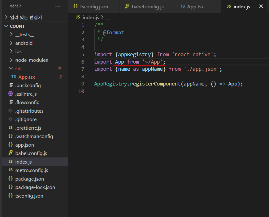
마지막으로, index.js 의 import path 를 수정합니다.
이제 run 하면 app 실행
$ npm run android
또는 $ react-native run-android
기본 환경 설정 및 app 실행을 끝냈으니,
Count App 을 본격적으로 만들어보겠습니다.
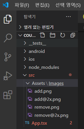
1. app 에 들어갈 icon 다운로드 https://material.io/resources/icons/?icon=trending_down&style=baseline
add_circle (+) , remove_circle (-) IOS 또는 Android 로 png download 하고
src/Assets/Images/ 폴더 생성 후, 다운로드한 이미지를 넣습니다.
- @2x @3x 로 naming 하면 React-Native 에서 알아서 resolution 에 맞는 적절한 size의 image가 들어갑니다.
2. App.tsx 를 다시 작성.
- <View Component 내에 <Counter> function conponent 를 넣습니다 />
- Counter function 은 String 형 title param 과 number 형 initValue param 2개 Props 를 가집니다.
import React from 'react';
import Styled from 'styled-components/native';
import Counter from './Screens/Counter';

const Container = Styled.View`
 flex: 1;
 background-color: #EEE;
`;

const App = () => {
  return (
    <Container>
      <Counter title="This is a Counter App" initValue={5} />
    </Container>
  );
};
export default App;
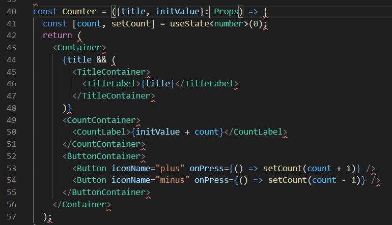
3. Counter 폴더에 index.tsx 코드 작성.
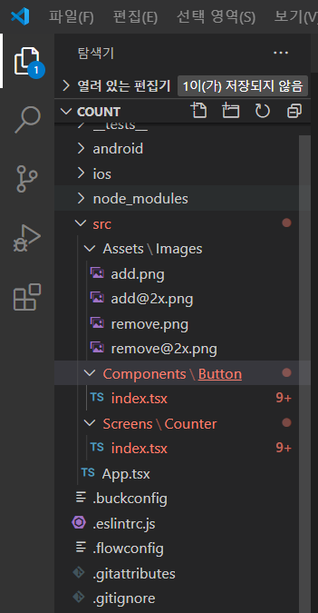
- TitleContainer Styled View Component에 title props로 넘어온 text를 뿌려주고
- CountLabel Styled Text Component에 initValue + count , 5 + 0 = 5 값으로 처음 app이 실행됩니다.
- ButtonContainer Styled View Component 안에는 Button function component 2개를 row 로 넣고
props로 string text 와 onPress event를 전달합니다.
- state : const [count, setCount] = useState<number>(0);
count 값은 0으로 초기화하고, onPress 시 setCount() 를 호출하여 count variable 값을 + / - 합니다.
import React, {useState} from 'react';
import Styled from 'styled-components/native';
import Button from '~/Components/Button';
const Container = Styled.SafeAreaView`
flex: 1;
background-color: #fec;
`;
const TitleContainer = Styled.View`
flex: 1;
justify-content: center;
align-items: center;
`;
const TitleLabel = Styled.Text`
font-size: 24px;
`;
const CountContainer = Styled.View`
flex: 2;
justify-content: center;
align-items: center;
background-color: #fee;
`;
const CountLabel = Styled.Text`
font-size: 24px;
font-weight: bold;
`;
const ButtonContainer = Styled.View`
flex: 1;
flex-direction: row;
flex-wrap: wrap;
justify-content: space-around;
background-color: #fff;
`;
interface Props {
title?: string;
initValue: number;
}
const Counter = ({title, initValue}: Props) => {
const [count, setCount] = useState<number>(0);
return (
<Container>
{title && (
<TitleContainer>
<TitleLabel>{title}</TitleLabel>
</TitleContainer>
)}
<CountContainer>
<CountLabel>{initValue + count}</CountLabel>
</CountContainer>
<ButtonContainer>
<Button iconName="plus" onPress={() => setCount(count + 1)} />
<Button iconName="minus" onPress={() => setCount(count - 1)} />
</ButtonContainer>
</Container>
);
};
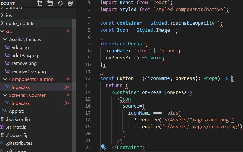
export default Counter;4. Button 폴더에 index.tsx 코드 작성.
- TouchableOpacity component 내에 Image 를 넣고, Props 인자로 iconName string 과 onPress event 가 넘어와 click 시 상위 Click Event 를 Counter function component 로 넘겨줍니다.
import React from 'react';
import Styled from 'styled-components/native';

const Container = Styled.TouchableOpacity``;
const Icon = Styled.Image``;

interface Props {
  iconName: 'plus' | 'minus';
  onPress?: () => void;
}

const Button = ({iconName, onPress}: Props) => {
  return (
    <Container onPress={onPress}>
      <Icon
        source={
          iconName === 'plus'
            ? require('~/Assets/Images/add.png')
            : require('~/Assets/Images/remove.png')
        }
      />
    </Container>
  );
};

export default Button;
코드는 모두 작성되었고 가장 중요한
5. 동작 확인.
$ npm run android
또는 $ react-native run-android
결론, 소규모 project에는 사용하지 않는 편이 유리해 보입니다.
- Visual Studio Code 에 tsx + babel plugin 쓰면 waring 이 많이 보여서 불편 (왼쪽)
- styled-component 활용해보니 편하지는 않다
- styled-component를 부른건 지, function component 를 부른건 지 분간이 안가
코드 가독성이 떨어진다 (오른쪽),
- 코드가 길어진다.
- expo 쓰다가 react-native cli 넘어오니 여러모로 복잡한게 많다
expo counter app 예제는 여기 https://yannichoongs.tistory.com/156
styled-component를 잘 정리해 놓으면
GUI 디자이너가 따로 있고 engineer 는 가져다 쓰기만 하면 되는 형태가 될 것 같네요.
'Mobile 개발 > RN(React Native)' 카테고리의 다른 글
| React Native - expo 활용 Counter App (useState 복습) (0) | 2020.08.05 |
|---|---|
| 스무디 한잔 마시며 끝내는 React Native - TodoList App (0) | 2020.08.03 |
| 스무디 한잔 마시며 끝내는 React Native - 기본기 닦기 (0) | 2020.07.22 |
| React Native - React 기본 문법 (0) | 2020.07.16 |
| React Native - To do app, 그리고 유투브 인강 (0) | 2020.07.04 |