원 형태로, View component 의 background를 그리려다가 찾아낸 정보 입니다.
필요한 도형이 있다면, 아래 코드블럭을 참조하세요~
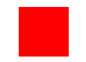
Square
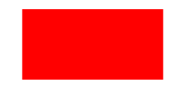
Rectangle
Nothing too crazy here either
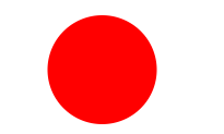
Circle
One note to mention about border radius is that it doesn't work like the web. So if you go more than 50% you'll start forming a weird diamondy shape.
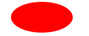
Oval
Border radius wasn't working, lets just do a circle and scale it...
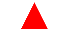
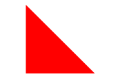
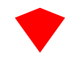
Triangle Up
CSS border triangles still work in React Native.
}, });
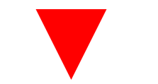
Here we get to cheat a bit. You could do this on the web too, but rather than adjust the borders we'll just rotate it.
Triangle Down
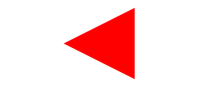
Triangle Left
Triangle Right
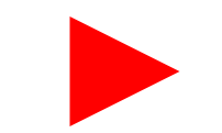
Again we'll cheat here and go for the rotation!
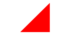
Triangle Top Left
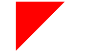
Triangle Top Right
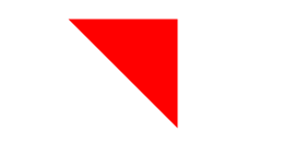
Triangle Bottom Left
Triangle Bottom Right
Curved Tail Arrow
Well we don't have the ability to do pseudo elements but they were just hacks anyway so we'll just create a wrapping View with 2 elements and style them. Now this is not exactly the same, and it's partially due to the way border-radius are managed in react-native vs the web but it's closeish.

The difference with this one is we had to double our width. Why? I don't know.
Parallelogram
If only we had skew. :( Luckily we have the triangles we created earlier.
Star (6-points)
These Triangles sure are coming in handy.
Star (5-points)
Yaye TriangleUp is killing it. This one is REALLY hacky with the placement, could use some fine tuning.

Pentagon
No TriangleUp here but we could have used a Corner Triangle with rotate.
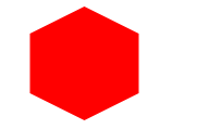
Hexagon
2 Triangles and a square. Everything is just shapes.
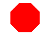
Octagon
I attempted copied the css on this one but it required setting a background color, so I did 4 bars and just rotated them. Slightly more markup but this is just for fun.
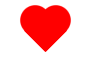
Heart
This one is easy since well I already had it done for my previous tutorial.
Infinity
Width and border radius all work oddly together. So baby infinity? Scale it up if you want it bigger.

Diamond Square
This was more than just a rotated square. Am I missing something?
Diamond Shield
Just 2 triangles, thought this one was going to be harder.
Diamond Narrow
Another 2 triangles that could have been the same and rotated. This way works too.
});
Cut Diamond
The top could have been used for the octagon, I chose a different way though.
Egg
Circular things are hard to do in RN. This is eggish.
Pac-Man
This one is so simple but always so fun.
Talk Bubble
This one is also simple, triangle and a rounded square.
12 Point Burst
I will admit this one confused be a little bit, then I realized it's just a couple of rotated squares.
8 Point Burst
Just like the 12, but one less square and different rotations. Only thing here is because the pseudo element was positionined relative to the first 20 degree rotation and ours isn't we'll just bump it up to 155.
Yin Yang
This one I don't like because you can't accomplish it without setting a background. Ohwell. Also weird border issue causing outlines.
Badge Ribbon
Remember, always add backgroundColor: 'transparent' when you are overlapping things.
Space Invader
WUTTTTTTTTTTT
TV Screen
Stupid border radius making this one hard. We'll just use a bunch of ovals.
Chevron
Once again we don't have skew, but we'll use triangles. Also magical negative scale to flip stuff around!
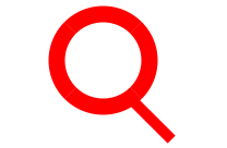
Magnifying Glass
Border around a circle with a stick. Nothing to it.
Facebook Icon
This one seems appropriate but couldn't get it to work well. I attempted it and failed.

Moon
Box shadow...
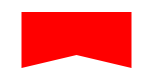
Flag
The one on css-tricks inferred a background, we'll just flip it around and say the center is transparent and the outer triangles are red.
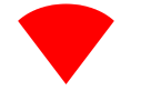
Cone
Had to modify the css on this one a bit to get the same look, 70 => 55.
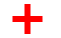
Cross
More of a plus then a cross.
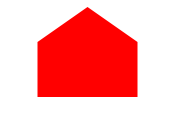
Base Home
Base... Home .. Home Base, whichever all the same.
Square
const Square = () => {
return <View style={styles.square} />;
};
StyleSheet.create({
square: {
width: 100,
height: 100,
backgroundColor: "red",
},
});
Rectangle
Nothing too crazy here either
const Rectangle = () => {
return <View style={styles.rectangle} />;
};
StyleSheet.create({
rectangle: {
width: 100 * 2,
height: 100,
backgroundColor: "red",
},
});
Circle
One note to mention about border radius is that it doesn't work like the web. So if you go more than 50% you'll start forming a weird diamondy shape.
const Circle = () => {
return <View style={styles.circle} />;
};
StyleSheet.create({
circle: {
width: 100,
height: 100,
borderRadius: 100 / 2,
backgroundColor: "red",
},
});
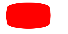
Oval
Border radius wasn't working, lets just do a circle and scale it...
const Oval = () => {
return <View style={styles.oval} />;
};
StyleSheet.create({
oval: {
width: 100,
height: 100,
borderRadius: 50,
backgroundColor: "red",
transform: [{ scaleX: 2 }],
},
});
Triangle Up
CSS border triangles still work in React Native.
const Triangle = () => {
return <View style={[styles.triangle, this.props.style]} />;
};
StyleSheet.create({
triangle: {
width: 0,
height: 0,
backgroundColor: "transparent",
borderStyle: "solid",
borderLeftWidth: 50,
borderRightWidth: 50,
borderBottomWidth: 100,
borderLeftColor: "transparent",
borderRightColor: "transparent",
borderBottomColor: "red",
},
});
Here we get to cheat a bit. You could do this on the web too, but rather than adjust the borders we'll just rotate it.
Triangle Down
const TriangleDown = () => {
return <Triangle style={styles.triangleDown} />;
};
StyleSheet.create({
triangleDown: {
transform: [{ rotate: "180deg" }],
},
});
Triangle Left
const TriangleLeft = () => {
return <Triangle style={styles.triangleLeft} />;
};
StyleSheet.create({
triangleLeft: {
transform: [{ rotate: "-90deg" }],
},
});
Triangle Right
const TriangleRight = () => {
return <Triangle style={styles.triangleRight} />;
};
StyleSheet.create({
triangleRight: {
transform: [{ rotate: "90deg" }],
},
});
Again we'll cheat here and go for the rotation!
Triangle Top Left
const TriangleCorner = () => {
return <View style={[styles.triangleCorner, this.props.style]} />;
};
StyleSheet.create({
triangleCorner: {
width: 0,
height: 0,
backgroundColor: "transparent",
borderStyle: "solid",
borderRightWidth: 100,
borderTopWidth: 100,
borderRightColor: "transparent",
borderTopColor: "red",
},
});
Triangle Top Right
const TriangleCornerTopRight = () => {
return <TriangleCorner style={styles.triangleCornerTopRight} />;
};
StyleSheet.create({
triangleCornerTopRight: {
transform: [{ rotate: "90deg" }],
},
});
Triangle Bottom Left
const TriangleCornerBottomLeft = () => {
return <TriangleCorner style={styles.triangleCornerBottomLeft} />;
};
StyleSheet.create({
triangleCornerBottomLeft: {
transform: [{ rotate: "270deg" }],
},
});
Triangle Bottom Right
const TriangleCornerBottomRight = () => {
return <TriangleCorner style={styles.triangleCornerBottomRight} />;
};
StyleSheet.create({
triangleCornerBottomRight: {
transform: [{ rotate: "180deg" }],
},
});
Curved Tail Arrow
Well we don't have the ability to do pseudo elements but they were just hacks anyway so we'll just create a wrapping View with 2 elements and style them. Now this is not exactly the same, and it's partially due to the way border-radius are managed in react-native vs the web but it's closeish.
const CurvedTailArrow = () => {
return (
<View style={styles.curvedTailArrow}>
<View style={styles.curvedTailArrowTail} />
<View style={styles.curvedTailArrowTriangle} />
</View>
);
};
StyleSheet.create({
curvedTailArrow: {
backgroundColor: "transparent",
overflow: "visible",
width: 30,
height: 25,
},
curvedTailArrowTriangle: {
backgroundColor: "transparent",
width: 0,
height: 0,
borderTopWidth: 9,
borderTopColor: "transparent",
borderRightWidth: 9,
borderRightColor: "red",
borderStyle: "solid",
transform: [{ rotate: "10deg" }],
position: "absolute",
bottom: 9,
right: 3,
overflow: "visible",
},
curvedTailArrowTail: {
backgroundColor: "transparent",
position: "absolute",
borderBottomColor: "transparent",
borderLeftColor: "transparent",
borderRightColor: "transparent",
borderBottomWidth: 0,
borderLeftWidth: 0,
borderRightWidth: 0,
borderTopWidth: 3,
borderTopColor: "red",
borderStyle: "solid",
borderTopLeftRadius: 12,
top: 1,
left: 0,
width: 20,
height: 20,
transform: [{ rotate: "45deg" }],
},
});
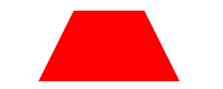
Trapezoid
The difference with this one is we had to double our width. Why? I don't know.
const Trapezoid = () => {
return <View style={styles.trapezoid} />;
};
StyleSheet.create({
trapezoid: {
width: 200,
height: 0,
borderBottomWidth: 100,
borderBottomColor: "red",
borderLeftWidth: 50,
borderLeftColor: "transparent",
borderRightWidth: 50,
borderRightColor: "transparent",
borderStyle: "solid",
},
});
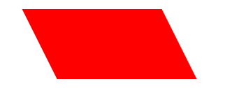
Parallelogram
If only we had skew. :( Luckily we have the triangles we created earlier.
const Parallelogram = () => {
return (
<View style={styles.parallelogram}>
<TriangleUp style={styles.parallelogramRight} />
<View style={styles.parallelogramInner} />
<TriangleDown style={styles.parallelogramLeft} />
</View>
);
};
StyleSheet.create({
parallelogram: {
width: 150,
height: 100,
},
parallelogramInner: {
position: "absolute",
left: 0,
top: 0,
backgroundColor: "red",
width: 150,
height: 100,
},
parallelogramRight: {
top: 0,
right: -50,
position: "absolute",
},
parallelogramLeft: {
top: 0,
left: -50,
position: "absolute",
},
});
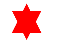
Star (6-points)
These Triangles sure are coming in handy.
const StarSix = () => {
return (
<View style={styles.starsix}>
<TriangleUp style={styles.starSixUp} />
<TriangleDown style={styles.starSixDown} />
</View>
);
};
StyleSheet.create({
starsix: {
width: 100,
height: 100,
},
starSixUp: {
position: "absolute",
top: 0,
left: 0,
},
starSixDown: {
position: "absolute",
top: 25,
left: 0,
},
});
Star (5-points)
Yaye TriangleUp is killing it. This one is REALLY hacky with the placement, could use some fine tuning.
const StarFive = () => {
return (
<View style={styles.starfive}>
<TriangleUp style={styles.starfiveTop} />
<View style={styles.starfiveBefore} />
<View style={styles.starfiveAfter} />
</View>
);
};
StyleSheet.create({
starfive: {
width: 150,
height: 150,
},
starfiveTop: {
position: "absolute",
top: -45,
left: 37,
},
starfiveBefore: {
backgroundColor: "transparent",
position: "absolute",
left: 0,
top: 0,
borderStyle: "solid",
borderRightWidth: 100,
borderRightColor: "transparent",
borderBottomWidth: 70,
borderBottomColor: "red",
borderLeftWidth: 100,
borderLeftColor: "transparent",
transform: [{ rotate: "35deg" }],
},
starfiveAfter: {
backgroundColor: "transparent",
position: "absolute",
top: 0,
left: -25,
width: 0,
height: 0,
borderStyle: "solid",
borderRightWidth: 100,
borderRightColor: "transparent",
borderBottomWidth: 70,
borderBottomColor: "red",
borderLeftWidth: 100,
borderLeftColor: "transparent",
transform: [{ rotate: "-35deg" }],
},
});
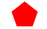
Pentagon
No TriangleUp here but we could have used a Corner Triangle with rotate.
const Pentagon = () => {
return (
<View style={styles.pentagon}>
<View style={styles.pentagonInner} />
<View style={styles.pentagonBefore} />
</View>
);
};
StyleSheet.create({
pentagon: {
backgroundColor: "transparent",
},
pentagonInner: {
width: 90,
borderBottomColor: "red",
borderBottomWidth: 0,
borderLeftColor: "transparent",
borderLeftWidth: 18,
borderRightColor: "transparent",
borderRightWidth: 18,
borderTopColor: "red",
borderTopWidth: 50,
},
pentagonBefore: {
position: "absolute",
height: 0,
width: 0,
top: -35,
left: 0,
borderStyle: "solid",
borderBottomColor: "red",
borderBottomWidth: 35,
borderLeftColor: "transparent",
borderLeftWidth: 45,
borderRightColor: "transparent",
borderRightWidth: 45,
borderTopWidth: 0,
borderTopColor: "transparent",
},
});
Hexagon
2 Triangles and a square. Everything is just shapes.
const Hexagon = () => {
return (
<View style={styles.hexagon}>
<View style={styles.hexagonInner} />
<View style={styles.hexagonBefore} />
<View style={styles.hexagonAfter} />
</View>
);
};
StyleSheet.create({
hexagon: {
width: 100,
height: 55,
},
hexagonInner: {
width: 100,
height: 55,
backgroundColor: "red",
},
hexagonAfter: {
position: "absolute",
bottom: -25,
left: 0,
width: 0,
height: 0,
borderStyle: "solid",
borderLeftWidth: 50,
borderLeftColor: "transparent",
borderRightWidth: 50,
borderRightColor: "transparent",
borderTopWidth: 25,
borderTopColor: "red",
},
hexagonBefore: {
position: "absolute",
top: -25,
left: 0,
width: 0,
height: 0,
borderStyle: "solid",
borderLeftWidth: 50,
borderLeftColor: "transparent",
borderRightWidth: 50,
borderRightColor: "transparent",
borderBottomWidth: 25,
borderBottomColor: "red",
},
});
Octagon
I attempted copied the css on this one but it required setting a background color, so I did 4 bars and just rotated them. Slightly more markup but this is just for fun.
const Octagon = () => {
return (
<View style={styles.octagon}>
<View style={[styles.octagonUp, styles.octagonBar]} />
<View style={[styles.octagonFlat, styles.octagonBar]} />
<View style={[styles.octagonLeft, styles.octagonBar]} />
<View style={[styles.octagonRight, styles.octagonBar]} />
</View>
);
};
StyleSheet.create({
octagon: {},
octagonBar: {
width: 42,
height: 100,
backgroundColor: "red",
},
octagonUp: {},
octagonFlat: {
position: "absolute",
top: 0,
left: 0,
transform: [{ rotate: "90deg" }],
},
octagonLeft: {
position: "absolute",
top: 0,
left: 0,
transform: [{ rotate: "-45deg" }],
},
octagonRight: {
position: "absolute",
top: 0,
left: 0,
transform: [{ rotate: "45deg" }],
},
});
Heart
This one is easy since well I already had it done for my previous tutorial.
const Heart = () => {
return (
<View {...this.props} style={[styles.heart, this.props.style]}>
<View style={styles.leftHeart} />
<View style={styles.rightHeart} />
</View>
);
};
StyleSheet.create({
heart: {
width: 50,
height: 50,
},
heartShape: {
width: 30,
height: 45,
position: "absolute",
top: 0,
borderTopLeftRadius: 15,
borderTopRightRadius: 15,
backgroundColor: "#6427d1",
},
leftHeart: {
transform: [{ rotate: "-45deg" }],
left: 5,
},
rightHeart: {
transform: [{ rotate: "45deg" }],
right: 5,
},
});
Infinity
Width and border radius all work oddly together. So baby infinity? Scale it up if you want it bigger.
const Infinity = () => {
return (
<View style={styles.infinity}>
<View style={styles.infinityBefore} />
<View style={styles.infinityAfter} />
</View>
);
};
StyleSheet.create({
infinity: {
width: 80,
height: 100,
},
infinityBefore: {
position: "absolute",
top: 0,
left: 0,
width: 0,
height: 0,
borderWidth: 20,
borderColor: "red",
borderStyle: "solid",
borderTopLeftRadius: 50,
borderTopRightRadius: 50,
borderBottomRightRadius: 50,
borderBottomLeftRadius: 0,
transform: [{ rotate: "-135deg" }],
},
infinityAfter: {
position: "absolute",
top: 0,
right: 0,
width: 0,
height: 0,
borderWidth: 20,
borderColor: "red",
borderStyle: "solid",
borderTopLeftRadius: 50,
borderTopRightRadius: 0,
borderBottomRightRadius: 50,
borderBottomLeftRadius: 50,
transform: [{ rotate: "-135deg" }],
},
});
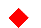
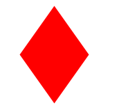
Diamond Square
This was more than just a rotated square. Am I missing something?
const Diamond = () => {
return <View style={styles.diamond} />;
};
StyleSheet.create({
diamond: {
width: 50,
height: 50,
backgroundColor: "red",
transform: [{ rotate: "45deg" }],
},
});
Diamond Shield
Just 2 triangles, thought this one was going to be harder.
const DiamondShield = () => {
return (
<View style={styles.diamondShield}>
<View style={styles.diamondShieldTop} />
<View style={styles.diamondShieldBottom} />
</View>
);
};
StyleSheet.create({
diamondShield: {
width: 100,
height: 100,
},
diamondShieldTop: {
width: 0,
height: 0,
borderTopWidth: 50,
borderTopColor: "transparent",
borderLeftColor: "transparent",
borderLeftWidth: 50,
borderRightColor: "transparent",
borderRightWidth: 50,
borderBottomColor: "red",
borderBottomWidth: 20,
},
diamondShieldBottom: {
width: 0,
height: 0,
borderTopWidth: 70,
borderTopColor: "red",
borderLeftColor: "transparent",
borderLeftWidth: 50,
borderRightColor: "transparent",
borderRightWidth: 50,
borderBottomColor: "transparent",
borderBottomWidth: 50,
},
});
Diamond Narrow
Another 2 triangles that could have been the same and rotated. This way works too.
const DiamondNarrow = () => {
return (
<View style={styles.diamondNarrow}>
<View style={styles.diamondNarrowTop} />
<View style={styles.diamondNarrowBottom} />
</View>
);
};
StyleSheet.create({
diamondNarrow: {
width: 100,
height: 100,
},
diamondNarrowTop: {
width: 0,
height: 0,
borderTopWidth: 50,
borderTopColor: "transparent",
borderLeftColor: "transparent",
borderLeftWidth: 50,
borderRightColor: "transparent",
borderRightWidth: 50,
borderBottomColor: "red",
borderBottomWidth: 70,
},
diamondNarrowBottom: {
width: 0,
height: 0,
borderTopWidth: 70,
borderTopColor: "red",
borderLeftColor: "transparent",
borderLeftWidth: 50,
borderRightColor: "transparent",
borderRightWidth: 50,
borderBottomColor: "transparent",
borderBottomWidth: 50,
},
});
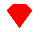
Cut Diamond
The top could have been used for the octagon, I chose a different way though.
const CutDiamond = () => {
return (
<View style={styles.cutDiamond}>
<View style={styles.cutDiamondTop} />
<View style={styles.cutDiamondBottom} />
</View>
);
};
StyleSheet.create({
cutDiamond: {
width: 100,
height: 100,
},
cutDiamondTop: {
width: 100,
height: 0,
borderTopWidth: 0,
borderTopColor: "transparent",
borderLeftColor: "transparent",
borderLeftWidth: 25,
borderRightColor: "transparent",
borderRightWidth: 25,
borderBottomColor: "red",
borderBottomWidth: 25,
},
cutDiamondBottom: {
width: 0,
height: 0,
borderTopWidth: 70,
borderTopColor: "red",
borderLeftColor: "transparent",
borderLeftWidth: 50,
borderRightColor: "transparent",
borderRightWidth: 50,
borderBottomColor: "transparent",
borderBottomWidth: 0,
},
});
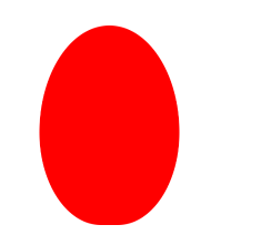
Egg
Circular things are hard to do in RN. This is eggish.
const Egg = () => {
return <View style={styles.egg} />;
};
StyleSheet.create({
egg: {
width: 126,
height: 180,
backgroundColor: "red",
borderTopLeftRadius: 108,
borderTopRightRadius: 108,
borderBottomLeftRadius: 95,
borderBottomRightRadius: 95,
},
});
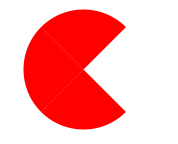
Pac-Man
This one is so simple but always so fun.
const PacMan = () => {
return <View style={styles.pacman} />;
};
StyleSheet.create({
pacman: {
width: 0,
height: 0,
borderTopWidth: 60,
borderTopColor: "red",
borderLeftColor: "red",
borderLeftWidth: 60,
borderRightColor: "transparent",
borderRightWidth: 60,
borderBottomColor: "red",
borderBottomWidth: 60,
borderTopLeftRadius: 60,
borderTopRightRadius: 60,
borderBottomRightRadius: 60,
borderBottomLeftRadius: 60,
},
});
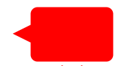
Talk Bubble
This one is also simple, triangle and a rounded square.
const TalkBubble = () => {
return (
<View style={styles.talkBubble}>
<View style={styles.talkBubbleSquare} />
<View style={styles.talkBubbleTriangle} />
</View>
);
};
StyleSheet.create({
talkBubble: {
backgroundColor: "transparent",
},
talkBubbleSquare: {
width: 120,
height: 80,
backgroundColor: "red",
borderRadius: 10,
},
talkBubbleTriangle: {
position: "absolute",
left: -26,
top: 26,
width: 0,
height: 0,
borderTopColor: "transparent",
borderTopWidth: 13,
borderRightWidth: 26,
borderRightColor: "red",
borderBottomWidth: 13,
borderBottomColor: "transparent",
},
});
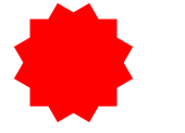
12 Point Burst
I will admit this one confused be a little bit, then I realized it's just a couple of rotated squares.
const TwelvePointBurst = () => {
return (
<View style={styles.twelvePointBurst}>
<View style={styles.twelvePointBurstMain} />
<View style={styles.twelvePointBurst30} />
<View style={styles.twelvePointBurst60} />
</View>
);
};
StyleSheet.create({
twelvePointBurst: {},
twelvePointBurstMain: {
width: 80,
height: 80,
backgroundColor: "red",
},
twelvePointBurst30: {
width: 80,
height: 80,
position: "absolute",
backgroundColor: "red",
top: 0,
right: 0,
transform: [{ rotate: "30deg" }],
},
twelvePointBurst60: {
width: 80,
height: 80,
position: "absolute",
backgroundColor: "red",
top: 0,
right: 0,
transform: [{ rotate: "60deg" }],
},
});
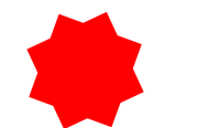
8 Point Burst
Just like the 12, but one less square and different rotations. Only thing here is because the pseudo element was positionined relative to the first 20 degree rotation and ours isn't we'll just bump it up to 155.
const EightPointBurst = () => {
return (
<View style={styles.eightPointBurst}>
<View style={styles.eightPointBurst20} />
<View style={styles.eightPointBurst155} />
</View>
);
};
StyleSheet.create({
eightPointBurst: {},
eightPointBurst20: {
width: 80,
height: 80,
backgroundColor: "red",
transform: [{ rotate: "20deg" }],
},
eightPointBurst155: {
width: 80,
height: 80,
position: "absolute",
backgroundColor: "red",
top: 0,
left: 0,
transform: [{ rotate: "155deg" }],
},
});
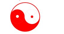
Yin Yang
This one I don't like because you can't accomplish it without setting a background. Ohwell. Also weird border issue causing outlines.
const YinYang = () => {
return (
<View style={styles.yinyang}>
<View style={styles.yinyangMain} />
<View style={styles.yinyangBefore} />
<View style={styles.yinyangAfter} />
</View>
);
};
StyleSheet.create({
yinyang: {},
yinyangMain: {
width: 100,
height: 100,
borderColor: "red",
borderTopWidth: 2,
borderLeftWidth: 2,
borderBottomWidth: 50,
borderRightWidth: 2,
borderRadius: 50,
},
yinyangBefore: {
position: "absolute",
top: 24,
left: 0,
borderColor: "red",
borderWidth: 24,
borderRadius: 30,
},
yinyangAfter: {
position: "absolute",
top: 24,
right: 2,
backgroundColor: "red",
borderColor: "white",
borderWidth: 25,
borderRadius: 30,
},
});
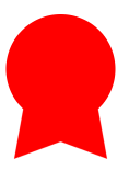
Badge Ribbon
Remember, always add backgroundColor: 'transparent' when you are overlapping things.
const BadgeRibbon = () => {
return (
<View style={styles.badgeRibbon}>
<View style={styles.badgeRibbonCircle} />
<View style={styles.badgeRibbonNeg140} />
<View style={styles.badgeRibbon140} />
</View>
);
};
StyleSheet.create({
badgeRibbonCircle: {
width: 100,
height: 100,
backgroundColor: "red",
borderRadius: 50,
},
badgeRibbon140: {
backgroundColor: "transparent",
borderBottomWidth: 70,
borderBottomColor: "red",
borderLeftWidth: 40,
borderLeftColor: "transparent",
borderRightWidth: 40,
borderRightColor: "transparent",
position: "absolute",
top: 70,
right: -10,
transform: [{ rotate: "140deg" }],
},
badgeRibbonNeg140: {
backgroundColor: "transparent",
borderBottomWidth: 70,
borderBottomColor: "red",
borderLeftWidth: 40,
borderLeftColor: "transparent",
borderRightWidth: 40,
borderRightColor: "transparent",
position: "absolute",
top: 70,
left: -10,
transform: [{ rotate: "-140deg" }],
},
});
Space Invader
WUTTTTTTTTTTT
TV Screen
Stupid border radius making this one hard. We'll just use a bunch of ovals.
const TvScreen = () => {
return (
<View style={styles.tvscreen}>
<View style={styles.tvscreenMain} />
<View style={styles.tvscreenTop} />
<View style={styles.tvscreenBottom} />
<View style={styles.tvscreenLeft} />
<View style={styles.tvscreenRight} />
</View>
);
};
StyleSheet.create({
tvscreen: {},
tvscreenMain: {
width: 150,
height: 75,
backgroundColor: "red",
borderTopLeftRadius: 15,
borderTopRightRadius: 15,
borderBottomRightRadius: 15,
borderBottomLeftRadius: 15,
},
tvscreenTop: {
width: 73,
height: 70,
backgroundColor: "red",
position: "absolute",
top: -26,
left: 39,
borderRadius: 35,
transform: [{ scaleX: 2 }, { scaleY: 0.5 }],
},
tvscreenBottom: {
width: 73,
height: 70,
backgroundColor: "red",
position: "absolute",
bottom: -26,
left: 39,
borderRadius: 35,
transform: [{ scaleX: 2 }, { scaleY: 0.5 }],
},
tvscreenLeft: {
width: 20,
height: 38,
backgroundColor: "red",
position: "absolute",
left: -7,
top: 18,
borderRadius: 35,
transform: [{ scaleX: 0.5 }, { scaleY: 2 }],
},
tvscreenRight: {
width: 20,
height: 38,
backgroundColor: "red",
position: "absolute",
right: -7,
top: 18,
borderRadius: 35,
transform: [{ scaleX: 0.5 }, { scaleY: 2 }],
},
});
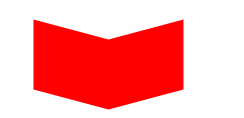
Chevron
Once again we don't have skew, but we'll use triangles. Also magical negative scale to flip stuff around!
const Chevron = () => {
return (
<View style={styles.chevron}>
<View style={styles.chevronMain} />
<View style={[styles.chevronTriangle, styles.chevronTopLeft]} />
<View style={[styles.chevronTriangle, styles.chevronTopRight]} />
<View style={[styles.chevronTriangle, styles.chevronBottomLeft]} />
<View style={[styles.chevronTriangle, styles.chevronBottomRight]} />
</View>
);
};
StyleSheet.create({
chevron: {
width: 150,
height: 50,
},
chevronMain: {
width: 150,
height: 50,
backgroundColor: "red",
},
chevronTriangle: {
backgroundColor: "transparent",
borderTopWidth: 20,
borderRightWidth: 0,
borderBottomWidth: 0,
borderLeftWidth: 75,
borderTopColor: "transparent",
borderBottomColor: "transparent",
borderRightColor: "transparent",
borderLeftColor: "red",
},
chevronTopLeft: {
position: "absolute",
top: -20,
left: 0,
},
chevronTopRight: {
position: "absolute",
top: -20,
right: 0,
transform: [{ scaleX: -1 }],
},
chevronBottomLeft: {
position: "absolute",
bottom: -20,
left: 0,
transform: [{ scale: -1 }],
},
chevronBottomRight: {
position: "absolute",
bottom: -20,
right: 0,
transform: [{ scaleY: -1 }],
},
});
Magnifying Glass
Border around a circle with a stick. Nothing to it.
const MagnifyingGlass = () => {
return (
<View style={styles.magnifyingGlass}>
<View style={styles.magnifyingGlassCircle} />
<View style={styles.magnifyingGlassStick} />
</View>
);
};
StyleSheet.create({
magnifyingGlass: {},
magnifyingGlassCircle: {
width: 100,
height: 100,
borderRadius: 50,
borderWidth: 15,
borderColor: "red",
},
magnifyingGlassStick: {
position: "absolute",
right: -20,
bottom: -10,
backgroundColor: "red",
width: 50,
height: 10,
transform: [{ rotate: "45deg" }],
},
});
Facebook Icon
This one seems appropriate but couldn't get it to work well. I attempted it and failed.
const Facebook = () => {
return (
<View style={styles.facebook}>
<View style={styles.facebookMain}>
<View style={styles.facebookCurve} />
<View style={styles.facebookBefore} />
<View style={styles.facebookAfter} />
<View style={styles.facebookRedCover} />
</View>
</View>
);
};
StyleSheet.create({
facebook: {
width: 100,
height: 110,
},
facebookMain: {
backgroundColor: "red",
width: 100,
height: 110,
borderRadius: 5,
borderColor: "red",
borderTopWidth: 15,
borderLeftWidth: 15,
borderRightWidth: 15,
borderBottomWidth: 0,
overflow: "hidden",
},
facebookRedCover: {
width: 10,
height: 20,
backgroundColor: "red",
position: "absolute",
right: 0,
top: 5,
},
facebookCurve: {
width: 50,
borderWidth: 20,
borderTopWidth: 20,
borderTopColor: "white",
borderBottomColor: "transparent",
borderLeftColor: "white",
borderRightColor: "transparent",
borderRadius: 20,
position: "absolute",
right: -8,
top: 5,
},
facebookBefore: {
position: "absolute",
backgroundColor: "white",
width: 20,
height: 70,
bottom: 0,
right: 22,
},
facebookAfter: {
position: "absolute",
width: 55,
top: 50,
height: 20,
backgroundColor: "white",
right: 5,
},
});
Moon
Box shadow...
Flag
The one on css-tricks inferred a background, we'll just flip it around and say the center is transparent and the outer triangles are red.
const Flag = () => {
return (
<View style={styles.flag}>
<View style={styles.flagTop} />
<View style={styles.flagBottom} />
</View>
);
};
StyleSheet.create({
flag: {},
flagTop: {
width: 110,
height: 56,
backgroundColor: "red",
},
flagBottom: {
position: "absolute",
left: 0,
bottom: 0,
width: 0,
height: 0,
borderBottomWidth: 13,
borderBottomColor: "transparent",
borderLeftWidth: 55,
borderLeftColor: "red",
borderRightWidth: 55,
borderRightColor: "red",
},
});
Cone
Had to modify the css on this one a bit to get the same look, 70 => 55.
const Cone = () => {
return <View style={styles.cone} />;
};
StyleSheet.create({
cone: {
width: 0,
height: 0,
borderLeftWidth: 55,
borderLeftColor: "transparent",
borderRightWidth: 55,
borderRightColor: "transparent",
borderTopWidth: 100,
borderTopColor: "red",
borderRadius: 55,
},
});
Cross
More of a plus then a cross.
const Cross = () => {
return (
<View style={styles.cross}>
<View style={styles.crossUp} />
<View style={styles.crossFlat} />
</View>
);
};
StyleSheet.create({
cross: {},
crossUp: {
backgroundColor: "red",
height: 100,
width: 20,
},
crossFlat: {
backgroundColor: "red",
height: 20,
width: 100,
position: "absolute",
left: -40,
top: 40,
},
});
Base
Base... Home .. Home Base, whichever all the same.
const Base = () => {
return (
<View style={styles.base}>
<View style={styles.baseTop} />
<View style={styles.baseBottom} />
</View>
);
};
StyleSheet.create({
base: {},
baseTop: {
borderBottomWidth: 35,
borderBottomColor: "red",
borderLeftWidth: 50,
borderLeftColor: "transparent",
borderRightWidth: 50,
borderRightColor: "transparent",
height: 0,
width: 0,
left: 0,
top: -35,
position: "absolute",
},
baseBottom: {
backgroundColor: "red",
height: 55,
width: 100,
},
});
출처 https://codedaily.io/tutorials/The-Shapes-of-React-Native
'Mobile 개발 > RN(React Native)' 카테고리의 다른 글
| Calendar Firebase 연동 library(ReactNative/Flutter) (0) | 2021.09.23 |
|---|---|
| xCode error 해결 - Errors were encountered while preparing your device for development. (0) | 2021.09.02 |
| react-native-vector-icon 깨짐 해결 (1) | 2021.08.12 |
| 리액트 네이티브 2021 ui kit top9 (0) | 2021.05.19 |
| 2021년 주목받는 하이브리드 앱 프레임워크 5가지 (0) | 2021.03.13 |